Top 10 big data visualization techniques
AuthorNina Tudor
DateJun 16, 2020
Data visualization refers to the implementation of contemporary visualization techniques to illustrate the relationships within data. By using visual elements like charts, graphs and maps, data visualization tools provide an accessible way to see and understand trends and patterns.
In the previous blogs, we talked about gathering and processing data. In order to be utilized, all of that gathered and processed data needs to be presented in a way that’s easily understandable. That is the main focus of data visualization because, in the world of big data, visualization tools and technologies are absolutely essential for anyone who wants to gather insights and make decisions from those massive datasets.

This layer of data management consists of 3 branches:
- Scientific visualization
- Puts an emphasis on the visualization of three-dimensional phenomena and graphically illustrating scientific data
- Information visualization
- Puts an emphasis on studying interactive visual representations of abstract data in order to enhance human cognition
- Visual analytics
- Puts an emphasis on interactive visual interfaces as core aspects of presenting analytical reasoning
Why is big data visualization important?
The short answer is that humans don’t have the capability to quickly make sense of large volumes of raw statistical information. Our eyes are not drawn to numbers, but to colors and patterns, so if we see a chart, we can quickly identify trends and patterns, and understand the meanings behind them.
The longer answer is that it enables us to:
- Review large amounts of data
- The graphical form enables us to quickly make sense of large amounts of data — much faster than going over raw numbers
- Spot trends
- Spotting trends within data is extremely complex, but techniques for big data visualization can make it much easier and faster — that’s important because a trend that is spotted early is an opportunity that can be acted upon
- Identify correlations
- Big data visualization enables us to explore entire data sets to gather insights — identifying patterns and relationships in data can provide businesses with huge competitive advantages
- Present the data to others
- Visualization techniques are also an effective way to communicate any insights to others — they convey meaning very quickly and in a way that it is easy to understand
Top 10 big data visualization techniques
When it comes to presenting data, there are a number of different visualization techniques you can choose, and although it may seem like you just need to pick one and it’ll be fine, the actual process is a bit more complex.
When choosing the right visualization technique, you always want to keep in mind these 4 questions:
- What relationship between data sets are you trying to understand?
- Do you want to compare multiple values or analyze a single value over time?
- Do you want to see the distribution of data and look for outliers?
- Are you interested in analyzing trends?
Your answers to these questions will guide you towards the ideal visualization technique for your system.
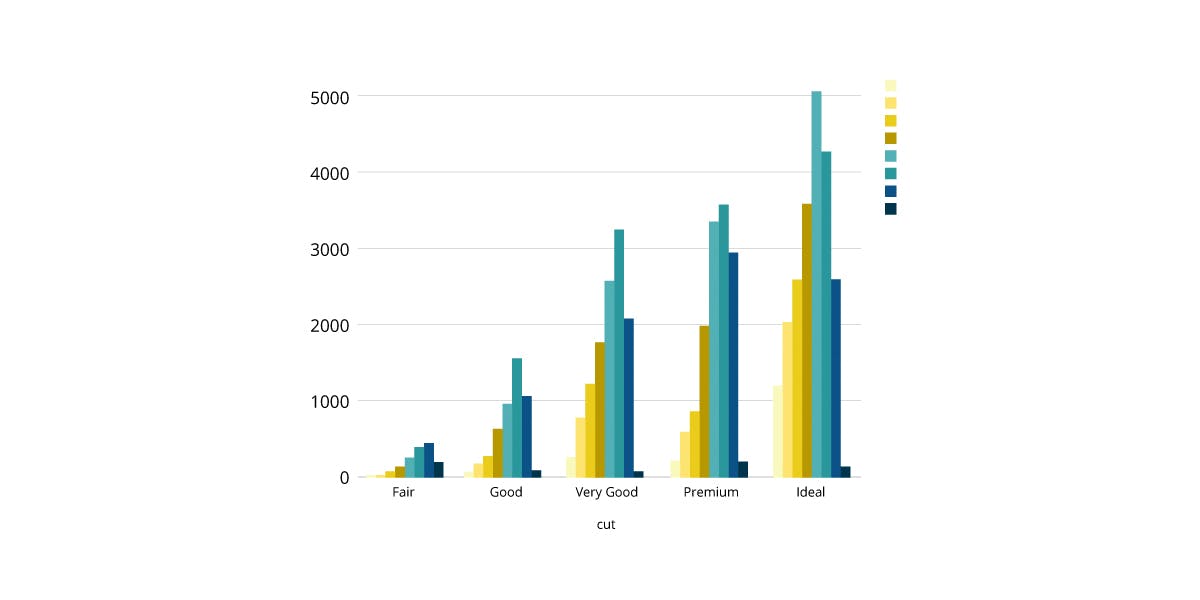
#01 Bar chart
Bar charts are similar to column charts — compared to them, bar charts have reversed axes and the number of bars can be much larger.
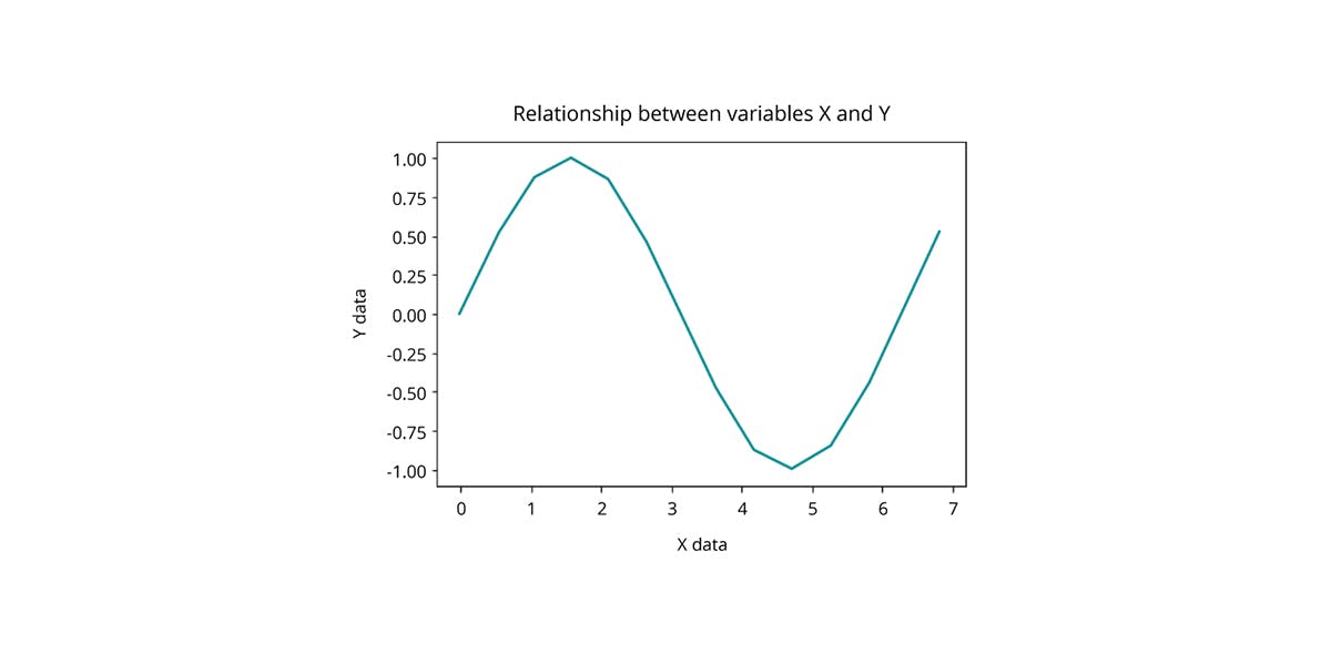
#02 Line chart
Line charts are used to show resulting data relative to a continuous variable — in most cases either time or money.
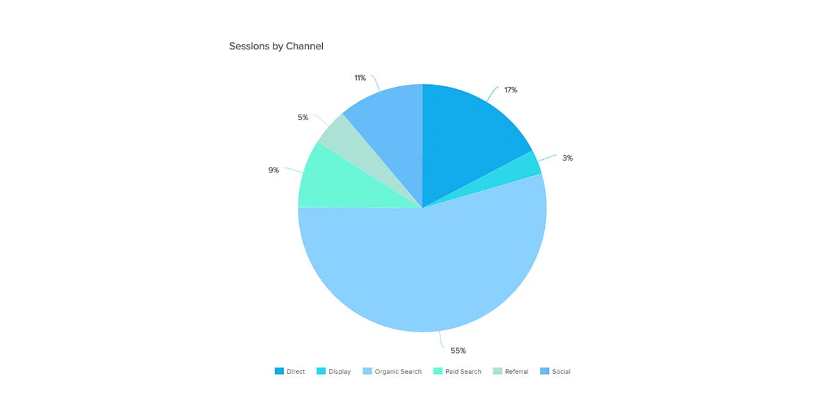
#03 Pie chart
Pie charts are used to compare the parts of a whole with the angle and the arc being proportional to the value represented — they are most effective when combined with text and percentages to describe the content.
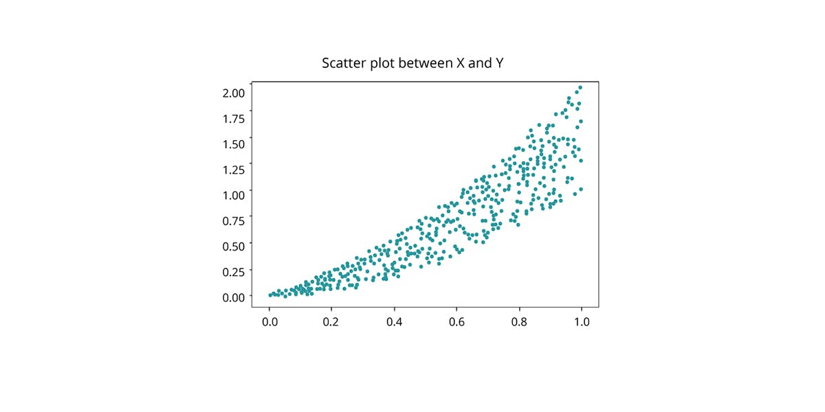
#04 Scatter plot
Scatter plots show two variables in the form of points on a coordinate system — by observing the distribution of the data points, we can deduct the correlation between the variables.
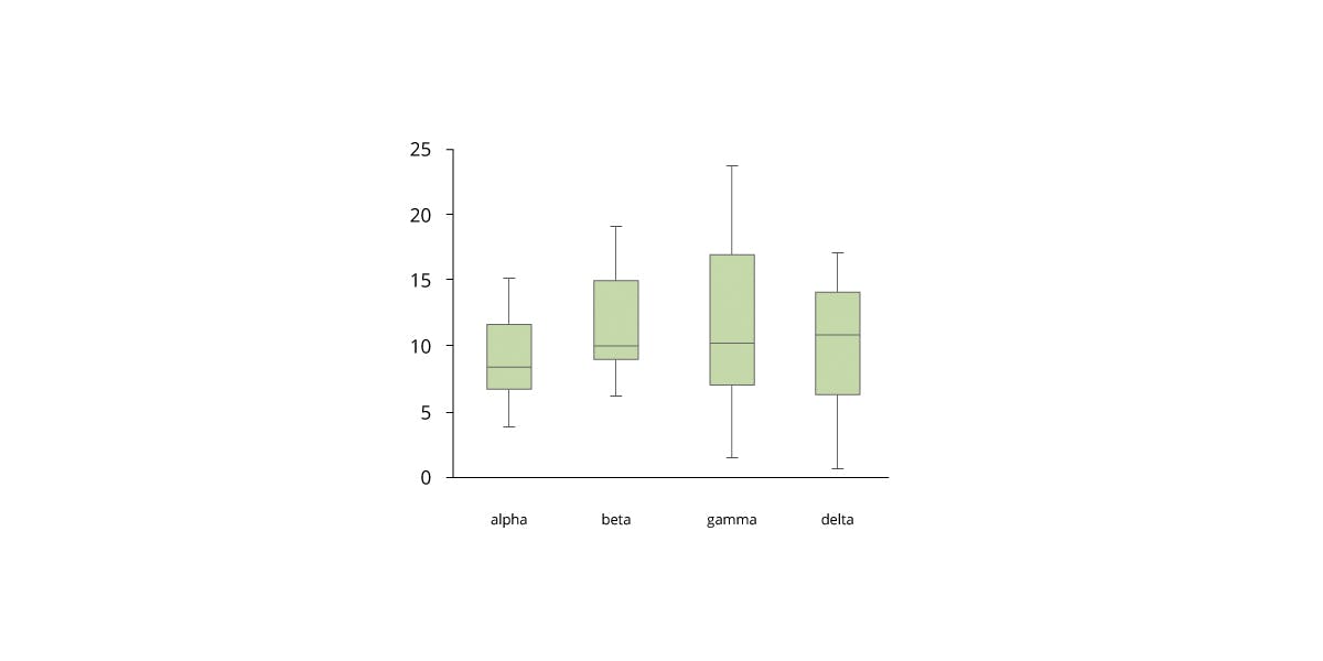
#05 Box plot
Box plots display a distribution of data across groups based on a five-number summary — minimum, first quartile, median, third quartile and maximum.
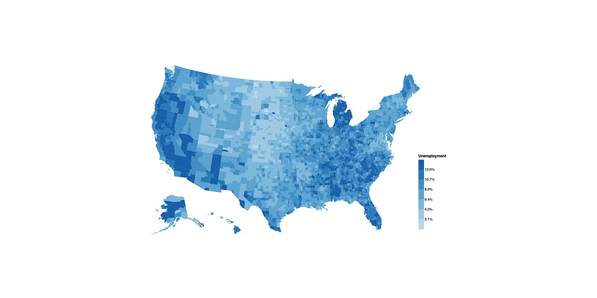
#06 Heatmap
Heatmaps or choropleths show the relationship between two variables and provide a rating — this is displayed through various colors or color saturation.
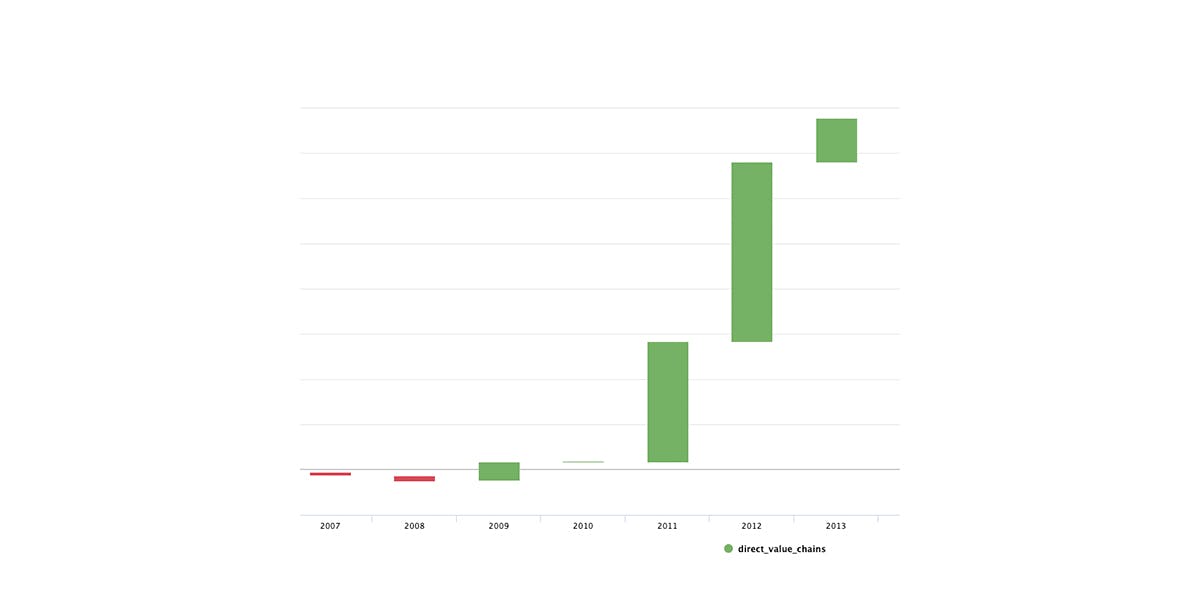
#07 Waterfall chart
Waterfall charts show how an initial value is affected by intermediate values and result in a final value — values can be either negative or positive.
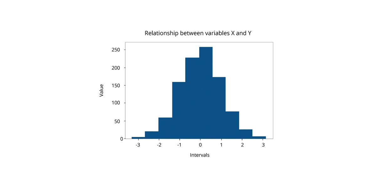
#08 Histogram
Histograms represent the distribution of a continuous variable over a given period of time — they give an estimate as to where the values are concentrated, what are the extremes and whether there are any gaps or unusual values.
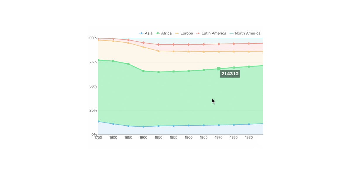
#09 Area chart
Area charts are similar to line graphs, but do a better job at highlighting the relative differences between elements — use them to see how different elements stack up or contribute to the whole.
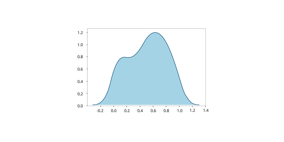
#10 Kernel density estimation
Kernel density estimations are used to avoid making assumptions when dealing with the parametric distribution of data that doesn’t make sense — if there is no knowledge about the population and the underlying distribution of data.
The full list of visualization techniques can be found in our “Value of data — business side of data gathering, processing and visualization” ebook.
Want to learn more about data visualization?
If you want to get more information about building advanced data gathering, processing and visualization software, or you’d like us to develop one specifically for your business – feel free to contact us. And before you do, make sure to download our latest ebook where you can learn more about data visualization techniques and learn what tools can be ideal for your business strategy. Download our free ebook here!